

VERBETES
Minna Citron
Arthur Wesley Dow
John Ferren
Sue Fuller
Stanley William Hayter
Blanche Lazzell
Boris Margo
John Marin
Gabor Peterdi
Minna Citron
Newark, NJ, EUA, 1896 – Nova York, NY, EUA, 1991
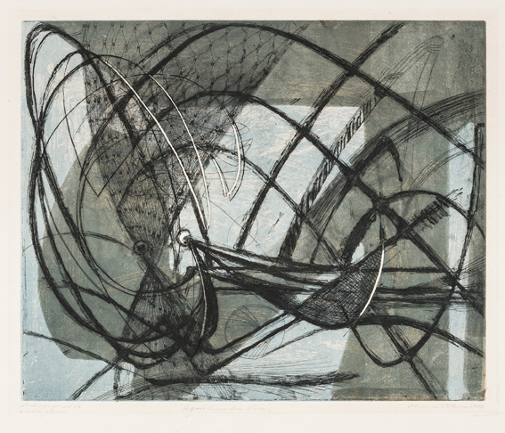
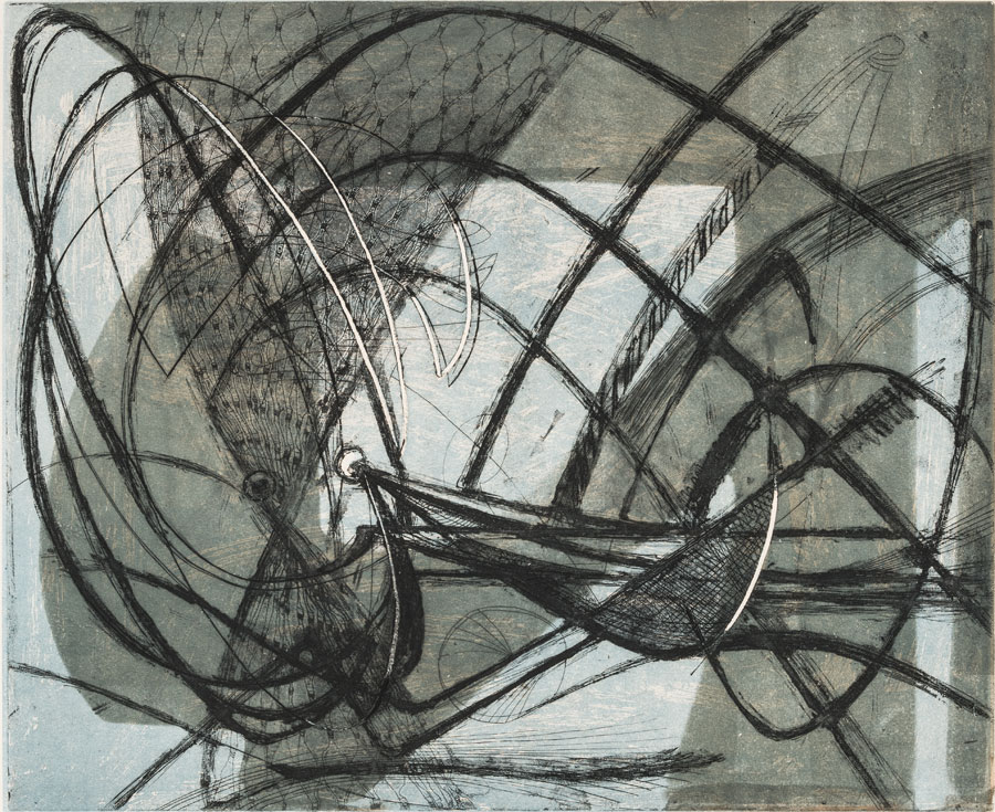
Squid Under Pier (Lula Sob Píer), 1948.
Água-forte em cores sobre papel (color engraving on paper), 56,5 x 65,1 cm [37,3 x 45,7 cm].
Doação Francisco Matarazzo Sobrinho (Donation by Francisco Matarazzo Sobrinho).
Proveniência: Doação por Nelson Rockefeller, 1951. Adquirida através da Galeria Weyhe, em Nova York (Provenance: Donation by Nelson Rockefeller, 1951. Acquired throug the Weyle Gallery, in New York).
Coleção MAC USP (Collection MAC USP)
Minna Citron descreveu a satisfação estética da arte moderna como a capacidade do espectador e do artista de compartilhar uma experiência conjunta baseada em dois fatores-chave. Primeiro, uma experiência compartilhada sobre a fisicalidade do momento de criação da obra de arte. Em segundo lugar, a força simbólica inconsciente da imagem.
Segundo Citron, os movimentos do artista são uma parte tão importante do trabalho quanto o registro visual resultante: “O observador sensível e compreensivo acompanhará o artista não apenas na experiência visual, mas também na cinestésica”. Essa trajetória gestual pode ser apreciada nos ritmos e tensões exibidos em Squid Under Pier. A energia animada e expansiva de Citron, muitas vezes circular e ampla, mas também linear e contida, é realizada em toda a superfície da chapa. Um movimento tão vigoroso que ultrapassa os limites da composição, criando fortes linhas negras curvilíneas; os tentáculos indomáveis de uma criatura marinha.
O segundo nível, baseado no inconsciente, se manifesta através do automatismo e do simbolismo. Citron era uma entusiasta de Freud e, como muitos artistas do Atelier 17, explorou a abordagem surrealista do desenho automático como método de liberação de conteúdo psicológico. Squid Under Pier sugere uma luta interna de uma criatura aprisionada em um ambiente claustrofóbico. A figura furiosa é colocada contra um fundo azul pálido sob uma estrutura verde ofuscante.
Minna Citron é artista do Atelier 17 que recebeu maior destaque no Brasil. Seu trabalho foi exposto nas I e II Bienais de São Paulo (1951 e 1953). Além disso, ela recebeu uma exposição individual de suas pinturas e gravuras no Museu de Arte Moderna de São Paulo, em 1952. Esse nível de exposição era raro para artistas do Atelier 17 no Brasil.
[english]
Minna Citron described the aesthetic satisfaction of modern art as the ability of the spectator and the artist to share a combined experience based on two key-factors. First, a shared experience about the physicality of the moment of creation of the artwork. Second, the unconscious symbolic force of the image.
According to Citron, the artist’s movements are as an important part of the work as the resulting visual register: “The sensitive and sympathetic observer will follow the artist not only in the visual but also in the kinesthetic experience”. This gestural trajectory can be appreciated in the rhythms and tensions displayed in Squid Under Pier. Citron’s animated and expansive energy, often circular and ample but also linear and contained, is performed all over the surface of the plate. A movement so energetic that it travels beyond the limits of the composition, creating strong black curvilinear lines; the untamed tentacles of a sea creature.
The second level, based on the unconscious, is expressed through automatism and symbolism. Citron was a keen practitioner of Freudian analysis and, as many artists at the Atelier 17, she explored the Surrealist approach of automatic drawing as a method of releasing psychological content. Squid Under Pier suggests an inner struggle of an entrapped creature in a claustrophobic environment. The distraught figure is laid against a pale blue background under an overshadowing green structure.
Minna Citron is one of the Atelier 17 artists that received greater notice in Brazil. Her work was exhibited in the I and II Sao Paulo Biennials (1951 and 1953) and she had a solo exhibition at the Museum of Modern Art of São Paulo, in 1952. Such a level of exposure was rare for Atelier 17 artists in Brazil.
Arthur Wesley Dow
Ipwich, MA, EUA, 1857 – Nova York, NY, EUA, 1922
Moonrise, c. 1898-1905
Xilogravura colorida sobre papel creme japonês (color woodcut on cream Japanese paper), 13,3 x 20 cm [10,8 x 17,8 cm].
Terra Foundation for American Art, Daniel J. Terra Collection.
Como artista e educador em Boston, Massachusetts, Arthur Wesley Dow procurou constantemente novas técnicas de criação de arte. Ele ficou encantado com as xilogravuras ukiyo-e do artista japonês Katsushika Hokusai (1760–1849), experimentando a técnica tradicional imprimindo de um único bloco diversas combinações de cores (em vez de usar blocos individuais para cada cor) para evocar diferentes estações ou momentos do dia. Moonrise exemplifica a investigação de Dow sobre o ukiyo-e e seu método para abstrair a paisagem do litoral de Massachusetts. A paisagem apresenta uma linha de horizonte alta, um efeito extraído diretamente das gravuras japonesas; mas as cores pálidas e aveludadas e uma linha lânguida e suave descrevendo colinas ondulantes e o amplo arco de um rio costeiro são típicas do estilo de Dow. Na falta de um bloco chave de sobreposição (o bloco que seria impresso por último, em cima de todas as cores, para delinear e distinguir os vários elementos da imagem), as cores nesta impressão se mesclam suavemente. Sendo uma das Ipswich Prints, um grupo de imagens de paisagem dos pântanos e canais da costa de Massachusetts, Moonrise foi um grande experimento para Dow. Conforme descreveu as Ipswich Prints, imagens como Moonrise “não representavam nenhum lugar, nenhum momento do dia ou estação de forma muito realista, mas sim, de uma maneira imaginativa, usavam alguns belos agrupamentos de linhas e formas, escolhidos do cenário da antiga cidade da Nova Inglaterra, como base para diferentes esquemas de cores, um padrão... para um mosaico de matizes e tons”.
[english]
As an artist and educator in Boston, Massachusetts, Arthur Wesley Dow consistently sought out new artmaking techniques. He became enamored with the ukiyo-e woodblock prints of Japanese artist Katsushika Hokusai (1760–1849), experimenting with the traditional technique by printing from a single block a variety of color combinations (instead of using individual blocks for each color) to evoke different seasons or times of day.
Moonrise exemplifies Dow’s investigation of ukiyo-e and his approach to abstracting the landscape of coastal Massachusetts. The landscape features a high horizon line, an effect taken directly from Japanese prints; but pale, velvety colors and a languid, soft line that describes undulating hills and the wide arc of a coastal river are typical of Dow’s style. Lacking an overlaying key block (the block that would be printed last, on top of all the colors, to outline and distinguish the various elements of the image), the colors in this impression blend sweetly together.
One of the Ipswich Prints, a group of landscape images of the marshes and waterways of coastal Massachusetts, Moonrise was a major experiment for Dow. As he described the Ipswich Prints, images like Moonrise were “not to represent any place, any time of day, or season very realistically, but rather, in an imaginative manner, to use some beautiful groupings of lines and shapes, chosen from the scenery of the old New England town, as a groundwork for different color schemes, a pattern…for a mosaic of hues and shades”.
John Ferren
Pendleton, OR, EUA, 1905 - Southampton, NY, EUA, 1970
Sea Forms, 1937
Xilogravura colorida sobre papel (color woodcut on paper), 54,6 x 40,8 cm (36.2 x 36.8 cm). Terra Foundation for American Art, Daniel J. Terra Collection
Com formação de escultor, John Ferren também foi um talentoso pintor e gravador. Seu trabalho bidimensional é impregnado de uma qualidade tridimensional inspirada por sua formação inicial, bem como pelo período passado no Atelier 17 de Stanley William Hayter em Paris. Ferren conheceu Hayter nos anos 1930 em Paris e passou um tempo significativo na oficina de Hayter.
Ferren fez inúmeras gravuras em papel e desenvolveu um processo para fazer relevos de gesso esculpidos de chapas impressas. A gravura em madeira Sea Forms remonta a esse tempo produtivo e experimental na carreira de Ferren. As formas volumosas, modeladas com precisão, são suavemente suspensas sobre um fundo verde chapado para enfatizar suas formas arredondadas. A paleta de cores frias e aquosas de Ferren – marrom, verde mar, azul claro e escuro – evoca a vida marinha, ao passo que linhas muito rasas, em arco no fundo da forma mais larga, e no meio da forma menor, aparecem como as cristas de uma concha marinha, contribuindo para o motivo náutico.
A natureza foi uma influência importante no trabalho de Ferren, e ele acreditava que todos os elementos do mundo natural eram inter-relacionados, mas também intercambiáveis, noção que se tornou base para sua abordagem abstrata. Embora siga o método tradicional de gravação em madeira, entalhando transversalmente ao veio, os detalhes que ele articula em Sea Forms – sulcos arqueados, hachureado sutil e uma aplicação habilidosa de várias cores para dar vida a um desenho abstrato complexo – demonstram a manipulação experiente e sofisticada de Ferren do bloco de madeira, bem como sua compreensão diferenciada dos elementos necessários para criar formas biomórficas únicas.
[english]
Trained as a sculptor, John Ferren was also a talented painter and printmaker. His two-dimensional work is infused with a three-dimensional quality inspired by his early training, as well as his time spent in Stanley William Hayter’s Atelier 17 in Paris. Ferren met Hayter while in Paris in the 1930s and spent significant time in Hayter’s workshop.
Ferren made numerous prints on paper and advanced a process to make carved plaster reliefs from printed plates. The wood engraving Sea Forms dates to this productive, experimental time in Ferren’s career. The voluminous, precisely modeled shapes are gently suspended on a flat green background intended to emphasize their rounded forms. Ferren’s cool, watery color palette — brown, sea green, light and dark blues — evokes marine life, while very shallow lines in the bottom of the larger form and in the middle of the smaller form appear like the ridges of a sea shell, adding to the nautical theme.
Nature was an important influence in Ferren’s work, and he believed that all elements of the natural world were interrelated but also interchangeable, a notion which became the basis for his approach to abstraction. While he follows the traditional method of wood engraving, cutting into the dense end-grain of a block of wood, the details he articulates in Sea Forms—ridges, crosshatching, and a skillful application of color to bring to life a complex abstract design—demonstrate Ferren’s sophisticated manipulation of the wood block, as well as his understanding of the elements necessary to create unique biomorphic shapes.
Sue Fuller
Pittsburg, Pensilvânia, USA, 1914 - Southampton, New York, USA, 2006
Hen (Galinha), 1945
Verniz mole e água-forte sobre papel (soft ground etching on paper), 46,4 x 49 cm [37,4 x 40,3 cm]. Tiragem: 17/50 (print edition).
Doação MAM SP (Donation by MAM SP). Proveniência: Adquirida por Nelson Rockefeller da Bertha Schaefer Gallery, em Nova York (Provenance: Acquired by Nelson Rockefeller from Bertha Schaefer Gallery, in New York).
Coleção MAC USP (Collection MAC USP)
Hen é uma das gravuras mais famosas de Sue Fuller. Ela produziu quatro etapas deste trabalho. A primeira etapa foi criada pela sobreposição de duas peças de renda semicirculares que formavam a gola de um dos vestidos de sua mãe. As etapas mostram um maior detalhamento de linhas seguintes à ponta-seca que formam as penas, a cabeça e o bico da ave. A gravura foi feita após a morte da mãe da artista e a escolha do tecido sugere uma ligação pessoal profunda e um significado simbólico desta gravura.
Hen foi feita enquanto Fuller trabalhava como assistente de Hayter. Esta gravura evidencia sua prática de incorporar tecidos ao processo da gravura, uma técnica amplamente utilizada por outros artistas do Atelier 17, mais notadamente Louise Bourgeois e o próprio Hayter. "Em vez de sombrear com linhas entrecruzadas, era possível usar um tecido e assim isto se tornou uma técnica de colagem em chapa de metal", descreveu Sue Fuller em uma entrevista.
Além da popularidade da prática entre outros artistas, a intensidade do interesse de Fuller pelo tecido foi particularmente aumentada por uma oficina em que ela participou sobre a técnica de tecelagem da Bauhaus, ministrada por Josef Albers em 1944, um ano antes de ela produzir Hen. Fuller acabaria abandonando totalmente a gravura e se dedicaria apenas à criação de composições esculturais em cordas durante os anos 1950.
[english]
Hen is one of Sue Fuller’s most famous prints. She produced four stages of this work. The first stage of Hen was created by overlapping two semicircular pieces of lace that formed the collar of one of her mother’s dress. The following stages of the print show increased detailing of etched lines that form the feathers, head and beak of the bird. This print was made after the death of the artist’s mother and the selection of fabric suggests a deep a personal connection and symbolic significance of this print.
Hen was made while Fuller was working as an assistant to Hayter. This print evidences her practice of incorporating textiles into the process of printmaking, a technique widely used by other Atelier 17 artists, most notoriously Louise Bourgeois and Hayter himself. “Instead of crosshatching, you could use a fabric and so it became a collage technique in metal plate”, described Sue Fuller in an interview.
Aside from the popularity of the practice among other artists, the intensity of Fuller’s interest in fabric was particularly heightened by a workshop she attended on the Bauhaus technique of weaving taught by Josef Albers in 1944, a year before she made Hen. Eventually, Fuller would abandon printmaking altogether and focus solely on creating sculptural string compositions during the 1950s.
Stanley William Hayter
Londres, Inglaterra, 1901 – Paris, França, 1988
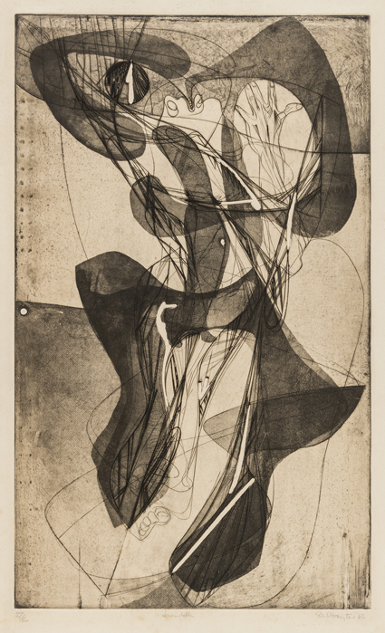
Tarantela (Tarantelle), 1943
Verniz mole e buril em cores sobre papel (color soft ground etching and buri non paper), 64 x 38,5 [55,2 x 33 cm]. Tiragem (print edition): 27/50.
Doação MAM SP (Donation by MAM SP). Proveniência: Adquirida por Nelson Rockefeller por meio da Galeria Buchholz. (Provenance: Acquired by Nelson Rockefeller throught the Buchholz Gallery).
Coleção MAC USP (Collection MAC USP).
Para Hayter, havia uma atitude de jogo ao fazer gravuras. Em New Ways of Gravure (1949), ele comparou a gravura a um jogo de xadrez. Um jogador experiente preveria os resultados com várias etapas de antemão, enquanto um novato só seria capaz de perceber a consequência imediata de um movimento.
A constante tiragem de provas de cada etapa de uma gravura era uma prática comum do Atelier 17 e permitia que os artistas aprendessem os efeitos de suas decisões na superfície da chapa. Esta gravura é a sexta etapa de Tarantelle, feita por Hayter em 1943 e incluída na exposição do MoMA Hayter e Studio 17: New Directions in Gravure, que viajou pela América Latina e foi um veículo importante para divulgar as ideias perturbadoras e atitudes não convencionais de Hayter em relação à gravura.
Tarantelle é uma impressão feita em técnica de verniz mole. Hayter revestiu a chapa com uma resina de cera e cobriu-a com uma folha de papel. Desenhar sobre a superfície com um lápis possibilitava que as linhas fossem pressionadas na superfície da cera. Assim que o papel é removido da chapa, o desenho é exposto (HAYTER, 1994, p. 6-13). Para continuar a desenvolver mais textura, uma prática comum no Atelier 17 era incorporar diversos tecidos (seda, gaze, malha e até madeira) para imprimir diferentes padrões. Os tecidos eram pressionados na resina, criando volume. A chapa era então revestida com verniz em certas seções e apenas porções específicas eram expostas ao ácido, criando o efeito de uma sombra sobreposta. Em Tarantelle, a combinação dessas duas técnicas cria um par de figuras humanas (uma feita de linha e outra de volume) que são emaranhadas em uma dança animada.
[english]
For Hayter, there was an attitude of play in making prints. In New Ways of Gravure (1949), he compared printmaking to a game of chess. An experienced player would foresee results many steps ahead, while a novice would only be able to perceive the immediate consequence of a movement.
The constant pulling of proofs from each stage of a print was a common practice of the Atelier 17 and allowed artists to learn the effects of their decisions on the surface of the plate. This print is the sixth stage of Tarantelle, made by Hayter in 1943 and included in the MoMA exhibition Hayter and Studio 17: New Directions in Gravure that traveled throughout Latin America and was an important vehicle to circulate Hayter’s disruptive ideas and unconventional attitudes towards printmaking.
Tarantelle is a print made in soft-ground technique. Hayter coated the plate with a wax resin and covered it with a sheet of paper. Drawing over the surface with a pencil allowed lines to be pressed onto the surface of the wax. Once the paper is removed from the plate, it is exposed the design. To continue to develop further texture, it was a common practice at the Atelier 17 to incorporate a variety of textiles (silk, gauze, net, and even wood) to imprint different patterns. The fabrics were pushed into the resin creating volume. The plate was then dressed with varnish in certain sections and only specific portions were exposed to acid, creating the effect of an overlapping shadow. In Tarantelle, the combination of these two techniques create a couple of human-like figures (one made of line and the other of volume) that are entangled in a spirited dance.
Stanley William Hayter
Londres, Inglaterra, 1901 – Paris, França, 1988
Cinq Personnages, 1946
Verniz mole, água-forte, com scoper e serigrafia [impressa em três cores: laranja, turquesa-verde e vermelho-violeta] em papel gosso de Knochi (engraving soft ground etching, silkscreen [printed in three colors; Orange, turquoise-green and red-violet] on thick Knochi paper), 51, 3 x 66 cm [37,5 x 60,6 cm].
Terra Foundation for American Art, Daniel J. Terra Collection.
Cinq Personnages é um tour de force da produção de Hayter como gravador. Com sua combinação de mídias, contorções, linhas biomórficas e cores vibrantes e inquietantes, a obra fala tanto de um momento particular da vida de Hayter quanto da revolução que ele liderou no campo da gravura.
Hayter era amplamente conhecido como gravador experimentalista e professor, uma qualidade que motivou sua liderança no Atelier 17 em Paris e Nova York. Era fascinado pela expressividade da gravação em cobre, uma técnica que havia saído de moda devido sua natureza exigente e morosa. Na superfície lisa e metálica do cobre, as linhas podiam ser desenhadas diretamente sobre a placa com uma liberdade que se coadunava com o interesse artístico de Hayter no desenho automático e nas formas orgânicas amorfas, ou biomorfismo.
Criada na versão nova-iorquina de seu estúdio Atelier 17, Cinq Personnages é uma obra-prima de técnica e inovação. Em um esforço distintamente criativo, Hayter aplicou três cores com serigrafia (as camadas de laranja, rosa e turquesa) em cima das linhas já gravadas em uma chapa de cobre, criando essa imagem em uma única passada em lugar de usar chapas individuais para cada cor e cada técnica. As linhas rodopiantes e as figuras contorcidas – cinq personnages é um título francês para “cinco figuras” – descrevem algo mais angustiado; este trabalho foi feito em memória do filho de Hayter, David, que morreu de tuberculose quando adolescente.
[english]
Cinq Personnages is a tour de force of Hayter’s production as a printmaker. With its combination of media; writhing, biomorphic lines; and vibrant, unsettling colors, it speaks both to a particular moment in Hayter’s life, as well as to the revolution the artist led in the field of printmaking.
Hayter was widely known as an experimental printmaker and teacher, a quality that infused his leadership of Atelier 17 in both Paris and New York. He was fascinated by the expressiveness of copper engraving, a technique that had fallen out of fashion due to its exacting and time-consuming nature. On the smooth, metallic surface of copper, lines could be drawn directly onto the plate with a freedom that aligned with Hayter’s artistic interest in automatic drawing and amorphous, organic shapes, or biomorphism.
Created at the New York iteration of Hayter’s Atelier 17 studio, Cinq Personnages is a technical and innovative masterpiece. In a distinctly creative endeavor, Hayter applied three silkscreened colors (the layered swoops of orange, pink, and turquoise) on top of lines already engraved into a copper plate, creating this image in a single pass instead of using individual plates for each color and technique. The swirling lines and contorted figures— cinq personnages is French for “five figures”— describe something more anguished, however; this work was made in memorial for Hayter’s son, David, who died of tuberculosis as a teenager.
Blanche Lazzell
Condado de Mongalia, WV, EUA, 1818 - Bourne, MA, EUA, 1959
Still Life, 1919
Xilogravura colorida (color woodcut), 42.2 x 39.4 cm [29,2 x 30,2 cm]. Terra Foundation for American Art, Daniel J. Terra Collection.
Embora se considerasse primeiro uma pintora, Blanche Lazzell tornou-se conhecida como uma das principais produtoras de xilogravura de linha branca, bem como uma colaboradora assídua de um grupo de artistas, principalmente mulheres gravadoras, conhecidas como Provincetown Printers. Em vez do método tradicional, usado por Dow -- cujo trabalho está exposto ao lado -- de entalhar cada segmento individual de uma gravura em blocos separados, o método de linha branca envolvia o entalhe da imagem inteira em um único bloco, aplicando cores em cada seção do bloco separadamente. Lazzell tornou-se proficiente nesta técnica, criando múltiplas gravuras em vários esquemas de cores por meio de pintura e repintura do bloco.
Still Life mostra uma reunião de objetos próximo à borda de uma mesa – um pequeno pedestal, duas tigelas, uma caixa retangular e uma pena. O estilo segmentado de tom de joia de Lazzell se alinha com as pinturas abstratas geométricas que ela começou a fazer no início dos anos 1920. Modernista ávida, ela era apaixonada por harmonia e composição. Em uma carta a sua irmã, escreveu: “… [A]s formas e cores devem estar tão relacionadas de modo a compor unidade, ritmo, equilíbrio, etc. Uma peça musical é uma composição de sons. [Meu trabalho] é uma composição de cores”.
[english]
While she considered herself a painter first, Blanche Lazzell became well known as a leading maker of white-line woodcut prints, as well as an active contributor to a group of artists, mostly female printmakers, known as the Provincetown Printers. Rather than the traditional method used by Arthur Wesley Dow, whose work is on view nearby, of cutting each individual segment of a print into separate blocks, the white-line method involved cutting the entire image into a single block, applying colors to each section of the block separately. Lazzell became proficient in this technique, creating multiple prints in various color schemes by painting and re-painting the block.
Still Life shows a gathering of objects near the edge of a table—a small pedestal, two bowls, a rectangular box, and a quill. Lazzell’s jewel-tone, segmented style aligns with the geometric abstract paintings she began making in the early 1920s. An avid modernist, she was passionate about harmony and composition. In a letter to her sister, she wrote: “…[T]he forms and colors must be so related to make unity, rhythm, balance, etc. A piece of music is a composition of sounds. [My work] is a composition of color”.
Boris Margo
Volochysk, Ucrânia, 1902 – Hyannis, MA, EUA, 1995
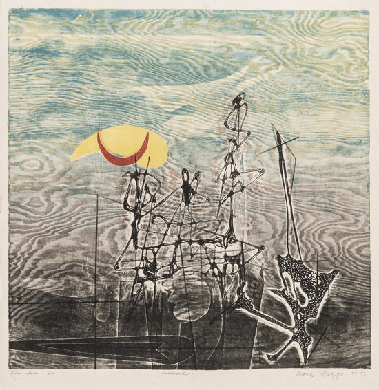 O Mar (The Sea), 1949
Cellocut em cores sobre papel (cellocut in collors on paper), 52,8 x 46,2 cm [42,1 x 42,2 cm]. Tiragem (print edition): 1/10.
Doação MAM SP (Donation by MAM SP). Proveniência: Doação por Nelson Rockefeller, 1951. Adquirida pela Jacques Seligman & Co Gallery (Provance: Donation by Nelson Rockefeller, 1951. Acquired from Jacques Seligman & Co Gallery).
Coleção MAC USP (MAC USP Collection).
Margo era um artista extremamente criativo. Desenvolveu várias técnicas novas em pintura e gravura. É conhecido por ter criado o processo de “decalcomania”, um método de pintura em que a tinta líquida é pressionada e transferida para outra superfície, produzindo formas e texturas abstratas, uma técnica também usada pelo artista surrealista Max Ernst.
Na gravura, Margo inventou a cellocut, na qual a folha de celuloide é misturada ao acetato e vertida sobre uma superfície dura, geralmente de papelão ou madeira. Uma vez que a mistura esteja seca e endurecida, ela pode ser gravada usando diferentes ferramentas, servindo como uma alternativa criativa para chapas de madeira ou cobre. Ele começou a experimentar com cellocut em 1932, por necessidade, durante a Grande Depressão, para contornar a falta de suprimentos artísticos disponíveis. Margo descobriu gradualmente que este material era flexível o suficiente para ser facilmente dissolvido e manipulado, criando novas possibilidades visuais.
A gravura The Sea é uma cellocut em que a mistura de celuloide foi derramada sobre uma base de madeira compensada. Margo usou um painel de madeira maior e uma pequena placa de celuloide de forma livre colocada sobre a madeira. Os padrões azuis e pretos obtidos entintando-se os veios da madeira criam formas onduladas que compõem o fundo da composição. No primeiro plano, uma nau fantasmagórica é feita de uma placa de celuloide de forma livre, entintada separadamente em preto e colocada sobre a base de compensado. A peça inteira é passada por uma prensa de água-forte em uma única tiragem.
Embora, Margo nunca tenha trabalhado no Atelier 17, teve participação essencial no ambiente inovador da gravura de Nova York em meados da década de 1940, devido suas contribuições técnicas nessa mídia.
[english]
Margo was a highly inventive artist that developed various new techniques in painting and printmaking. He is well-known for having created the process of “decalcomania”, a painting method in which liquid paint is pressed and transferred to another surface, producing abstract shapes and textures, a technique also used by Surrealist artist Max Ernst.
In printmaking, Margo invented the cellocut, in which celluloid sheet is mixed with acetate and poured over a hard surface, often cardboard or wood. Once the mixture is dry and hardened, it can be etched on by using different tools, serving as a creative alternative to wood or copper plates. He started experimenting with cellocut in 1932 out of necessity, during the Great Depression, to circumvent the lack of artistic supplies available. Margo gradually discovered this material was flexible enough that it could be easily dissolved and manipulated, creating new visual possibilities.
The print The Sea is a cellocut in which the celluloid mixture was poured over a Plywood base. Margo used a larger wood panel and a smaller free form celluloid plate placed over the wood. The blue and black patterns obtained from inking the wood grains create wave-like shapes that form the background of the composition. In the forefront, a phantasmagorical vessel is made from a free form celluloid plate, inked separately in black, and placed over the plywood base. The entire piece is put through an etching press in one single printing.
Although Margo did never work at Atelier 17, he was very much a part of the innovative printmaking environment of New York in the mid-1940s due to his technical contributions to the medium.
John Marin
Rutheford, NJ, EUA, 1870 – Addison, ME, EUA, 1953
Brooklyn Bridge no. 6, 1913
Água-forte sobre papel (etching on off-white wove paper)
Tiragem: uma edição de cerca de 12 (print edition: from na edition of about 12), 39,7 x 34,6 cm (27.3 x 22.4 cm).
Terra Foundation for American Art, Daniel J. Terra Collection.
Retornando à cidade de Nova York em 1911, depois de passar vários anos estudando arte em Paris, John Marin ficou surpreso com o rápido crescimento e a nova energia que Nova York havia desenvolvido enquanto ele esteve fora. Nesse mesmo ano, Marin produziu duas águas-fortes no estilo acadêmico que ele havia aperfeiçoado em Paris. No entanto, ele estava insatisfeito; a delicadeza dessas gravuras não transmitia a agitação da expansão da cena urbana de Nova York. Em 1913, Marin voltou à água-forte com uma abordagem diferente, voltando sua atenção para as “grandes forças em ação; grandes movimentos; os grandes edifícios e os pequenos edifícios…” e as “influências de uma massa sobre outra massa maior ou menor”.
Brooklyn Bridge, no. 6, transmite o caráter de Nova York por meio da qualidade dinâmica de suas linhas e vertiginosa composição ativa. A imagem é quase exclusivamente composta por linhas diagonais que convergem próximo à base de uma das torres monumentais da ponte. Marin exagera a altura da torre, afinando a forma à medida que ela sobe, apequenando a figura solitária da imagem. Marin fez suas águas-fortes usando o processo de entalhe, de modo que os valores de tons suaves em Brooklyn Bridge foram alcançados unicamente por meio de sua manipulação virtuosa da tinta na chapa da água-forte durante a impressão.
[english]
Returning to New York City in 1911 after spending several years studying art in Paris, John Marin was astonished by the rapid growth and new energy New York had developed while he was away. That same year, Marin produced two etchings in the academic style he had honed in Paris. However, he was dissatisfied; the delicacy of these prints did not convey the bustle of New York’s expanding urban scene. In 1913, Marin returned to etching with a different approach, turning his attention to the “great forces at work; great movements; the large buildings and the small buildings…” and the “influences of one mass on another greater or smaller mass”.
Brooklyn Bridge, no. 6 conveys New York City’s character through its dynamic line quality and dizzyingly active composition. The image is almost exclusively composed of diagonal lines, which converge near the base of one of the bridge’s monumental towers. Marin exaggerates the tower’s height by tapering the form as it rises, dwarfing the picture’s solitary figure. Marin made his etchings using the intaglio process, so the soft tonal values in Brooklyn Bridge were achieved solely through his virtuosic manipulation of ink on the etching plate during printing.
Gabor Peterdi
Budapeste, Hungria, 1915 - Stamford, CT, EUA, 2001
Sign of the Lobster [Signo da Lagosta], 1947-1948
Verniz mole e água tinta em cores sobre papel (soft color ground etching and acquationt on paper), 66,5 x 50,9 cm [50,4 x 37,7 cm].
Tiragem (print edition): 12/30
Doação MAM SP (Donation by MAM SP). Proveniência: Doação por Nelson Rockefeller, 1951. Adquirida diretamente do artista (Provenance: Donation by Nelson Rockefeller, 1951. Acquired directly from the artist).
Coleção MAC USP (MAC USP Collection).
Sign of the Lobster é frequentemente citada como uma das primeiras gravuras coloridas de Peterdi. Em 1947, ele começou a experimentar com a aplicação da aquarela escovada nas gravuras com estênceis. Nesta gravura, o artista desenhou uma figura antropomórfica com formas sugeridas pelo sexo feminino no centro. A figura é engolfada por um arranjo de cores primárias (amarelo, verde, laranja, preto, azul) que são aplicadas na gravura em várias camadas de estêncil.
Para Peterdi, a impressão colorida apresentava um dos maiores desafios no campo: "Na impressão em relevo combinada, o registo é particularmente difícil devido à expansão e encolhimento do papel úmido. Uma das inovações mais importantes que eliminou esse problema foi a combinação de chapas de entalhe com cores de superfície a estêncil. No início, usávamos estênceis de papel e aplicávamos cor com rolos de gelatina na placa de entalhe entintada. Isso, é claro, tinha grandes limitações, mas era eficaz se o conceito da imagem não exigisse texturas de cor ou modulações tonais (...) Experimentei exaustivamente com a combinação de entalhe e cores em offset. Para começar, usei apenas o estêncil no chapa, depois apliquei estêncil no papel e o imprimi com a chapa de entalhe levando as outras cores a estêncil. Isso aumentava a riqueza, mas ainda não me dava liberdade suficiente.
Peterdi continuaria a expandir as possibilidades da gravura colorida, incorporando recortes de linóleo sobre a chapa impressa, moldes de borracha sintética ou cortando a chapa e entintando diferentes segmentos com cores para obter gradações tonais mais complexas e diferenciadas."
[english]
Sign of the Lobster is often cited as one of Peterdi’s first color prints. In 1947, he started experimenting with the application of watercolor brushed onto the engravings with stencils. In this print, the artist designed an anthropomorphic figure with female-suggested forms at the center. The figure is engulfed by an array of primal colors (yellow, green, orange, black, blue) that are applied onto the print in multiple layers of stenciling.
For Peterdi, color printing presented one of the greatest challenges in the field: "In combination intaglio printing, the registering is particularly difficult because of the expanding and shrinking of wet paper. One of the most important innovations that eliminated this problem was the combination of intaglio plates with stenciled surface colors. At first, we used paper stencils and applied color with gelatin rollers on the inked intaglio plate. This, of course, had great limitations, but was effective if the concept of the image did not require color textures or tonal modulations (...) I experimented extensively with the combination of intaglio and offset colors. To begin I used only the stencil on the plate, then I stenciled on the paper and overprinted it with the intaglio plate that carries other stenciled colors. This increased the richness, but still did not give me enough freedom. Peterdi would continue to expand the possibilities of color printing by incorporating linoleum cuts over the printed plate, synthetic rubber molds or cutting the plate and inking different segments with colors to obtain more complex and nuanced tonal gradations."
© 2019 Museu de Arte Contemporânea da Universidade de São Paulo